Sign up before Midnight to watch our video,
“Biggest Ponzi Scheme in U.S. History to Crash,”
and get our daily e-letter Investment Contrarians.
We respect your privacy!
We will never rent/sell your e-mail address.
That’s a promise! And you can opt out at any time.
The BLS jobs
report covering September sparked controversy because of the large
three-tenths of a percent drop in the unemployment rate, down to 7.8%.
This fall corresponded to a reduction of 456,000 in the number of
unemployed. As dramatic as this decrease was, it was dwarfed by an
increase of 873,000 in the number of employed. This figure represented
not only the 456,000 unemployed who supposedly found jobs but a further
418,000 who entered into the labor force from outside it. These data
were all from the Household survey were fundamentally at odds with an
anemic increase in jobs of only 114,000 from the larger Establishment
survey.
The large increase in employment and decrease in unemployment were internally consistent within the Household survey, but, contradicted as they were by the jobs data from the Establishment survey, weren’t real. This raises the question of why they happened.
In part, the two surveys have very different levels of statistical significance. The larger Establishment survey has a threshold of 100,000 while the Household survey with this month’s problematical data is 400,000. But the size of the discrepancy, especially with regard to employment, in the September report goes beyond a simple mismatch in the data’s significance.
One large source of growth in employment in September was a 582,000 increase in the number of involuntary part time workers. While large, it is in keeping with August to September increases in this category over the last two years:
2010: 579,000
2011: 483,000
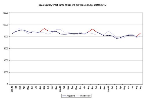
The problem with these August-September increases is that they aren’t real, as the graph above shows. The light blue line is the seasonally unadjusted data. The dark blue line is seasonally adjusted with the August-September peaks marked in red. These peaks are phantoms. In 2010 ane 2011, they don’t correspond to or compensate for anything in the unadjusted data. In 2012, there was a 268,000 increase in the unadjusted August-September number (far right of graph), but there is no rationale in the data to assume that the adjusted number should be larger, indeed twice as large.
At least as regards involuntary part time workers, this contradicts the argument that this month’s report was doctored for election purposes. The BLS has had the same recurring glitch in this category for the last three years. The real question is why they haven’t fixed it yet.
The other category I found significant was unemployment.
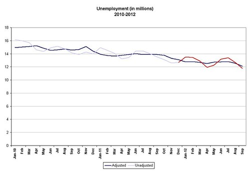
In this graph, I marked the unadjusted data for 2012 in red. If we look at the unadjusted data, it has an “M” like configuration (increased unemployment in the winter (bad weather) and summer (school’s out) with seasonal decreases in the spring (onset of good weather) and the fall (return to school and Christmas). This is clearest in 2012, but you can see it in 2010 and 2011 as well. The dark blue seasonally adjusted line, on the other hand, shows a series of baselines dropping year by year.
Now if we look at the two together, in 2012, as the winter surge in unemployment tails off into the spring in the unadjusted line, there is only a 173,000 decline in unemployment seasonally adjusted. Yet in the fall with very nearly the same configuration, we see a decline in the seasonally adjusted line (far right of graph) starting in August (133,000) and continuing into the September drop of 456,000. The big question is why. It could be said that intra-year comparisons aren’t valid, but if we look at the corresponding seasonally adjusted declines in unemployment for 2011, it occurs in November and in 2010, in December.
If you are conspiracy-minded, there is some evidence for you here. There very likely will be a further seasonally unadjusted decrease in unemployment going into Christmas, but this usually isn’t reflected in the seasonally adjusted “official” number for another couple of months. This is not so much a question of a phantom number as one temporally out of sync.
If we take the differences in accuracy of the two surveys into account, the phantom number of the involuntary part timers, and the temporally out of place one of the unemployed, we can explain most of the discrepancy between the September Household and Establishment surveys. I have no problem with the unemployment number, but I do have one with its timing, in terms of the data, not the election.
The large increase in employment and decrease in unemployment were internally consistent within the Household survey, but, contradicted as they were by the jobs data from the Establishment survey, weren’t real. This raises the question of why they happened.
In part, the two surveys have very different levels of statistical significance. The larger Establishment survey has a threshold of 100,000 while the Household survey with this month’s problematical data is 400,000. But the size of the discrepancy, especially with regard to employment, in the September report goes beyond a simple mismatch in the data’s significance.
One large source of growth in employment in September was a 582,000 increase in the number of involuntary part time workers. While large, it is in keeping with August to September increases in this category over the last two years:
2010: 579,000
2011: 483,000
The problem with these August-September increases is that they aren’t real, as the graph above shows. The light blue line is the seasonally unadjusted data. The dark blue line is seasonally adjusted with the August-September peaks marked in red. These peaks are phantoms. In 2010 ane 2011, they don’t correspond to or compensate for anything in the unadjusted data. In 2012, there was a 268,000 increase in the unadjusted August-September number (far right of graph), but there is no rationale in the data to assume that the adjusted number should be larger, indeed twice as large.
At least as regards involuntary part time workers, this contradicts the argument that this month’s report was doctored for election purposes. The BLS has had the same recurring glitch in this category for the last three years. The real question is why they haven’t fixed it yet.
The other category I found significant was unemployment.
In this graph, I marked the unadjusted data for 2012 in red. If we look at the unadjusted data, it has an “M” like configuration (increased unemployment in the winter (bad weather) and summer (school’s out) with seasonal decreases in the spring (onset of good weather) and the fall (return to school and Christmas). This is clearest in 2012, but you can see it in 2010 and 2011 as well. The dark blue seasonally adjusted line, on the other hand, shows a series of baselines dropping year by year.
Now if we look at the two together, in 2012, as the winter surge in unemployment tails off into the spring in the unadjusted line, there is only a 173,000 decline in unemployment seasonally adjusted. Yet in the fall with very nearly the same configuration, we see a decline in the seasonally adjusted line (far right of graph) starting in August (133,000) and continuing into the September drop of 456,000. The big question is why. It could be said that intra-year comparisons aren’t valid, but if we look at the corresponding seasonally adjusted declines in unemployment for 2011, it occurs in November and in 2010, in December.
If you are conspiracy-minded, there is some evidence for you here. There very likely will be a further seasonally unadjusted decrease in unemployment going into Christmas, but this usually isn’t reflected in the seasonally adjusted “official” number for another couple of months. This is not so much a question of a phantom number as one temporally out of sync.
If we take the differences in accuracy of the two surveys into account, the phantom number of the involuntary part timers, and the temporally out of place one of the unemployed, we can explain most of the discrepancy between the September Household and Establishment surveys. I have no problem with the unemployment number, but I do have one with its timing, in terms of the data, not the election.
Sign up before Midnight to watch our video,
“Biggest Ponzi Scheme in U.S. History to Crash,”
and get our daily e-letter Investment Contrarians.
We respect your privacy!
We will never rent/sell your e-mail address.
That’s a promise! And you can opt out at any time.
No comments:
Post a Comment